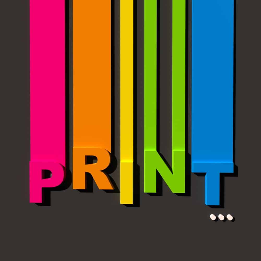
Aesthetic Appeal: Choosing the Perfect Fonts and Colors for Business Signage

In the bustling world of commerce, first impressions matter. Whether it’s a storefront sign, a banner at an event, or a billboard along the highway, your business signage speaks volumes about your brand. One of the key elements that can make or break the effectiveness of your signage is the choice of fonts and colors. In this guide, we’ll explore how to select the right fonts and colors to create eye-catching and memorable signage that resonates with your target audience.
Understanding the Power of Fonts
Fonts play a crucial role in conveying the personality and message of your brand. The font you choose should reflect the tone of your business – whether it’s formal, casual, playful, or elegant. Here are a few tips for selecting fonts for your signage:
a. Legibility is Key: Avoid overly decorative fonts that sacrifice readability, especially for signage that needs to be viewed from a distance. Opt for clean, sans-serif fonts like Arial or Helvetica for maximum legibility.
b. Consistency is Crucial: Maintain consistency in font choices across all your signage to reinforce brand recognition. Choose a primary font for headlines and a secondary font for supporting text to create hierarchy and visual interest.
c. Consider Brand Personality: Think about the personality traits you want to convey through your signage. If your brand is modern and innovative, choose sleek and contemporary fonts. For a more traditional or upscale brand, elegant serif fonts may be more appropriate.
Harnessing the Psychology of Colors
Colors have the power to evoke emotions and influence perceptions. When selecting colors for your business signage, it’s essential to consider the psychological impact they may have on your audience. Here are some guidelines for choosing colors that align with your brand identity and message:
a. Reflect Brand Identity: Your brand’s color palette should be consistent across all marketing materials, including signage. Choose colors that reflect the essence of your brand and resonate with your target audience.
b. Consider Cultural Associations: Keep in mind that different colors may have different cultural connotations. For example, while white symbolizes purity and simplicity in Western cultures, it is associated with mourning in some Eastern cultures. Be mindful of cultural sensitivities when selecting colors for international audiences.
c. Create Contrast: Use contrasting colors to make your signage stand out and improve readability. Pairing light text with a dark background or vice versa can enhance visibility and ensure that your message is easily seen from a distance.
Staying on Top of Sign Trends
Like any other aspect of design, signage trends evolve over time. Staying abreast of the latest sign trends can help ensure that your signage remains relevant and impactful. Here are a few sign trends to consider when designing your business signage:
a. Minimalist Design: Clean, minimalist signage continues to be a popular trend, particularly in urban environments where cluttered signage can easily get lost in the visual noise. Opt for simple layouts, ample white space, and understated fonts and colors to create a sleek and modern look.
b. Retro Revival: Nostalgia is a powerful marketing tool, and retro-inspired signage has made a comeback in recent years. Incorporating vintage fonts, colors, and design elements can evoke feelings of nostalgia and create a sense of authenticity and charm.
c. Sustainability and Eco-Friendly Materials: With increasing awareness of environmental issues, many businesses are opting for eco-friendly signage materials such as recycled paper, bamboo, or reclaimed wood. Not only does this align with consumers’ values, but it also adds a unique aesthetic appeal to your signage.
Testing and Iterating
Once you’ve chosen fonts and colors for your business signage, it’s essential to test them in real-world settings to ensure their effectiveness. Conducting A/B tests or gathering feedback from customers can help you fine-tune your signage and make adjustments as needed. Remember that signage is a dynamic aspect of your branding strategy, and it’s okay to iterate and evolve over time to stay relevant and impactful.
Choosing the right fonts and colors for your business signage is a critical aspect of branding and marketing. By understanding the power of fonts and colors, staying on top of sign trends, and testing and iterating your designs, you can create signage that effectively communicates your brand message and leaves a lasting impression on your target audience. Request a quote today for all you sign needs!
Three Locations to Serve You
Charleston, SC
(843) 552-2626
Columbia, SC
(803) 731-2001
Jacksonville, FL
(904) 724-4321


0 Comments