Design and Display Banners for the Best Creative Impact

Have you ever really considered how important it is to choose the best font for a banner? Sure, it seems like it is a no-brainer. However, there are fonts created that still do not quite hit the mark when it comes to showcasing a message and attracting the right kind of attention. There are literally thousands of fonts available for banners, but not all fonts are created equally. The problem is that every person asked about popular fonts is going to give you a different answer. So, how do you choose the font that is best for your banner?
Create Clarity with Font Size and Style
The most important factor when creating a banner is choosing the most flattering style and size of font. You want a customized banner to be easily read so that it attracts more attention. Below are a few excellent tips that can help you get started creating a banner and successfully attract the right kind of attention:
- If you need to use a small font, make sure it is bold in order to display better.
- Avoid using thin and cursive fonts; they are rarely ever easy to read.
- Every font varies in size, but using eight pixels or larger is wise.
- Use a clear font, such as Arial, for easy to read text.
It is a typical idea to believe the type of font and the size are going to be the only factors that require thought when it comes to a banner being noticeable. There are other factors that also play an important role as well. Banners are typically displayed in high traffic areas. These areas can be anywhere from highly traveled streets, shopping malls, billboards, and even office buildings. There are many marketing strategies to consider for each location, but none of these strategies matter if your banner is not designed to catch their attention first. Keep it simple with an easy message in order to instill instant recall in a consumer’s mind since you only have a few seconds to capture their eyes.
Color Adds Function to Form
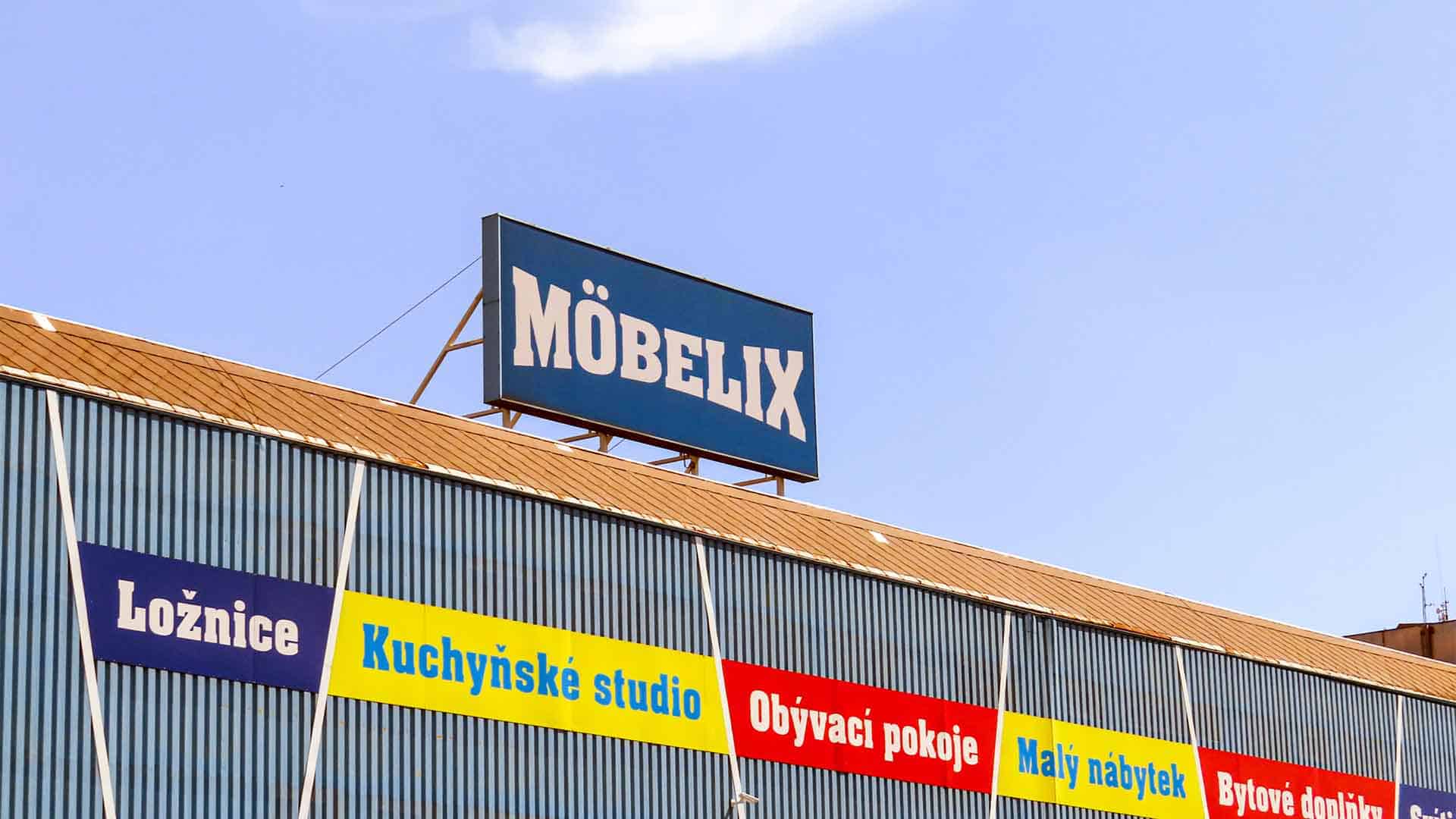
Color plays a vital role in conveying your message on a banner. It is a general rule of thumb to use contrasting colors that will make text stand out more. If you choose a light-colored font, then it is a good idea to use a dark background so the letters stand out. The same is true for a dark-colored font being easily read on a light-colored background. The higher the contrast, the better a font is going to be seen. When using a black background, it is advisable to avoid dark-blues, light-blues, browns, purples, and reds. This color combination will disappear from a short distance and render your banner unreadable.
Light the Way to View Banners Better
Designing a great banner requires that you know exactly where it is going to be placed. This allows you to consider the conditions and environment, so you are able to choose the best colors, sizing, and font to get the most out of your creative banner. If the area is poorly lit, you will want to use bright contrasting colors that are extremely noticeable, such as red on yellow or vice versa. Being able to digitally print a banner makes it easier than ever to create the perfect eye-catching color combinations.
Three Locations to Serve You
Charleston, SC
(843) 552-2626
Columbia, SC
(803) 731-2001
Jacksonville, FL
(904) 724-4321


0 Comments